The Color You Never Wear: Reading Avoidance as Quiet Information
By RedKnotr Editorial - 22/10/2026 - 0 comments
Ask someone their favourite colour and you will usually get an answer within a second. Ask them which colour they would never wear and the pause is longer, sometimes uncomfortable. That pause is the interesting part.
Color energy is usually read through three layered mechanisms: colour guides where the eye goes, colour triggers bodily sensation, and colour awakens personal and cultural memory. Preference draws mostly on the first two. Avoidance tends to run deeper, into the third, which is why it is harder to explain and often more informative.
Preference and avoidance are different signals
Liking a colour is cheap. You can like olive green because a jacket looked good in a shop window and never think about it again. Avoiding a colour is more specific: it is a small, repeated refusal, usually with a physical component. The garment gets tried on and taken off. The room gets repainted. The scarf stays in the drawer for four years.
Psychologists who study colour describe choice as a form of emotional regulation rather than a personality verdict. The relevant question is not which colours you like, but how rigidly you narrow the range, and what the narrowing is protecting.
What avoidance is usually about
Three themes come up again and again.
Visibility. Bright colour increases the chance of being looked at, and being looked at increases the chance of being evaluated. For anyone in a stretch of feeling exposed, muted tones function as a low-cost way to reduce perceived social risk. This is not vanity in reverse; it is the nervous system choosing the cheaper option.
Energy. Some colours ask something of the wearer. Red asks for presence, yellow asks for lightness, white asks for upkeep and exposure. When reserves are low, the ask feels like a demand.
Memory. A colour can belong to a person, a school uniform, a hospital corridor, a decade you would rather not revisit. This is the layer that logic cannot argue with, because the association was formed before you had words for it.
Practitioners of colour work put it simply: the colours you love describe your resources, the colours you refuse describe your edges.
A short map of common avoidances
Treat this as a set of questions, not a diagnosis. Context, culture and personal history outweigh any general meaning.
- Red. Often avoided during periods of wanting to stay under the radar, or when the idea of being seen feels tiring rather than exciting.
- Yellow. Frequently avoided by people who are running on empty and cannot currently perform cheerfulness. It reads as a demand to be upbeat.
- White. Can feel like a blank page, which is hopeful to some and confronting to others. Aversion sometimes tracks an unresolved ending rather than a fear of beginnings.
- Pink. Often avoided by people protecting a competent, unsoft public front. The refusal is usually about vulnerability, not about the colour.
- Black. Avoiding black is less common and often marks a period of wanting to be legible, open, no longer hidden.
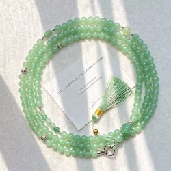
- Green. Sometimes avoided when life feels too noisy for the regulating, slow quality green tends to carry.
- Purple. Often avoided by people who feel disconnected from intuition or from a creative identity they once had.
If none of these land, that is useful too. It usually means the avoidance is personal and specific, and the memory layer is the one to explore.
Taste or armour: a rigidity test
The distinction that matters is not which colour you avoid but how you avoid it. Ask three questions:
- Could you wear the colour for one hour, in private, without distress?
- Does the aversion extend to objects and rooms, or only to your own body?
- Has the avoidance tightened over the past year, or stayed roughly the same?
Wide, stable, low-stakes avoidance is taste. Narrowing, body-specific, recently tightened avoidance is closer to armour, and armour is worth understanding rather than arguing with.
A gentle reintroduction: distance, edge, proximity
Colour does not have to be worn to be worked with. The most reliable method moves in three steps and never forces the issue.
Distance. Put the colour somewhere in your environment, not on your body: a mug, a book spine, a cushion, a phone wallpaper. Four or five days of low-stakes exposure tells you whether the aversion is visual or personal.
Edge. Move it closer but keep it peripheral: a lining, a sock, a hair tie, a small stone in a pocket. This is where most people discover the colour is perfectly tolerable when it is not the headline.
Proximity. One item, worn for two hours on a day you feel resourced. Not a statement outfit. A single piece, close to the body, with an easy exit.
The sequence matters because it separates the visual mechanism from the memory mechanism. If step one is comfortable and step three is not, you are not responding to the wavelength. You are responding to a story.
What not to conclude
You cannot read a personality from a palette, and a colour aversion is not a diagnosis of anything. People avoid colours for reasons of culture, profession, complexion, laundry, and simple aesthetic fatigue. What the avoidance offers is a question, not an answer: what would this colour ask of me right now, and am I willing to be asked?
Sometimes the answer is no, and that is a legitimate answer. The point is to know that you said it.
If you want to test a colour at the edge rather than the centre, a small stone or a slim band is the easiest place to start. The RedKnotr collection is built around exactly that kind of low-commitment proximity.
FAQ
Does avoiding a colour mean something is wrong?
No. Avoidance is information, not pathology. It becomes worth attention when it is rigid, recent and body-specific, or when it clearly costs you something you want.
Can a colour aversion change on its own?
Frequently, yes. Colour preferences shift with circumstances, and many people report a colour returning to their wardrobe after a period of change without any deliberate effort.
Should I force myself to wear a colour I dislike?
No. Forcing tends to harden the aversion. The distance, edge, proximity sequence works because each step is small enough to be reversible.
How long should I test a colour before deciding?
Two weeks of peripheral exposure is usually enough to know whether the discomfort is visual or narrative. Wearing it once and concluding is too fast.
Tags: color avoidance, color psychology, wardrobe colors, color energy, chromophobia
✧ Go deeper ✧
Explore more, shop the crystal, dive into the topic
Explore more articles
View all articles →- Black Is Not Just a Colour, It Is a Boundary: The Color Energy of Dark Neutrals and How to Wear Them Lightly 21/10/2026
- Gold or Silver? Reading Your Undertone as a Colour-Energy Compass (October 2026) 20/10/2026
- Tonal Dressing in Late October: Why One-Color Days Give Your Eyes and Mood a Rest 20/10/2026
- The Light Turns First: How Autumn Bulbs Quietly Rewrite Your Colour Palette (October 2026) 19/10/2026


This content is copyrighted by its original authors. In case of any infringement, please contact us for removal.
Comments
Write a comment