Color Energy Works in Three Layers: How to Read Them in Daily Life
By RedKnotr Editorial - 27/09/2026 - 0 comments
Color is usually treated as decoration — a matter of taste. But anyone who has felt a red room become aggressive, or a pale blue hospital corridor become calming, has already met color as something functional. Color energy is the practice of using that function deliberately.
The most useful way to understand it is not as one effect but as three layered mechanisms, all operating at once.
Layer One: Visual Focus
The first mechanism is attentional. Color directs the eye before any meaning is attached — warm, high-contrast hues pull focus; cool, low-contrast hues release it. This is why a red accent in a room keeps snagging your gaze while a sage wall lets it rest.
Practically: if your day requires sustained concentration, keep the dominant colors of your workspace quiet and give attention one deliberate place to land. If your morning is sluggish, introduce one warm anchor — a lamp, a mug, a scarf. You are aiming attention, not decorating.
Layer Two: Bodily Sensation
The second mechanism is physical association. Long before you have a thought about red, your body has a relationship with the warmth of fire and blood; with blue, of sky and water; with green, of vegetation and shade. Tradition maps these onto the chakra spectrum — red at the root for stability, orange for creative flow, yellow for confidence, green for balance, blue for expression, indigo for intuition, violet for connection.
Whether or not you work with the metaphysical map, the bodily layer is usable: warm tones tend to mobilize, cool tones tend to settle. When you feel scattered, surrounding yourself with green or blue gives the nervous system a suggestion of rest. When you feel flat, a deliberate touch of orange or yellow suggests movement.
Layer Three: Cultural and Personal Memory
The third layer is the deepest and the most personal. Red means celebration and luck in Chinese tradition, passion in the West, danger on a road sign. Your own memories add another layer entirely: the color of a childhood kitchen, a school uniform, a gift from someone you loved.
This is why generic color advice fails. The reliable question is not "what does this color mean?" but "what does this color mean to me, in this context?" A color that carries a nourishing memory for you can do more work in five seconds than a theoretically perfect color that leaves you cold.
A Simple Daily Practice
- Morning (30 seconds): choose one color for the day based on what the day asks of you — blue for a difficult conversation, yellow for a demanding task, green for a day that needs steadiness. Wear it or place it where you will see it.
- Midday (10 seconds): ask "what color do I need right now?" and trust the first answer. Look at it, breathe once, move on.
- Evening (30 seconds): notice which colors actually appeared in your day and how you felt in them. This is how you build your personal color map.
Seasonal Adjustment
As autumn arrives and natural light softens, many practitioners shift toward warm, grounded tones — amber, terracotta, deep red — to compensate for shorter days, while keeping one cool anchor for overstimulated evenings. The principle is balance with the environment, not obedience to a fixed palette.
FAQ
Is color energy scientifically proven? The physiological effects of color — how warm and cool wavelengths differently affect arousal and rest — are well documented in environmental psychology. The chakra and symbolic layers belong to tradition and personal experience rather than laboratory proof. Many people use both, holding each claim at its proper level.
Which color should I start with? Green. It is the most universally tolerable color for human vision, sits at the balance point between warm and cool, and is hard to overdose on — a plant on the desk is enough to begin.
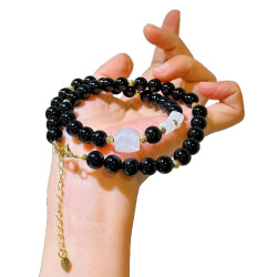
Does the color of jewelry matter? If you wear it daily, absolutely — a bracelet you see twenty times a day is twenty small color suggestions. Choose stones whose color matches the energy you are practicing, like these color-intentioned pieces.
Can colors conflict with each other? Not conflict, exactly — but a cluttered palette makes mixed suggestions. One clear color intention at a time usually works better than five competing ones.
Tags: color energy, color psychology, chakra colors, chromotherapy
Related Pieces
View All →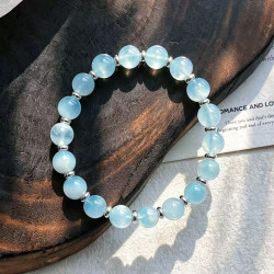

This content is copyrighted by its original authors. In case of any infringement, please contact us for removal.
Comments
Write a comment