Wearing the Season: Autumn 2026's Palette as a Daily Colour-Energy Practice
By RedKnotr Editorial - 16/10/2026 - 0 comments
Every autumn the wardrobe conversation is really a mood conversation. This season more than most: the Autumn 2026 collections — from muted clay and red mahogany to butter yellow and burnt olive — were designed, designers and stylists keep saying, less for the mirror than for the nervous system. Colour-energy practice has been making that argument for years. The palette on the runways simply made it visible: people are using colour not to impress anyone, but to steady themselves.
The Season’s Palette, Read Through Tradition
Muted clay and the brown family: the grounding notes
Muted clay, spice brown and red mahogany dominated the earth-tone end of the season. In colour-energy terms these are the hues of containment — low-saturation, warm, close to soil and hide and fired pottery. Practitioners of colour psychology describe them as lowering visual stimulation, the shades equivalent of a lowered voice. Many people find they are what to reach for on days when the world already feels loud.
Butter yellow: the small lamp
Butter yellow is the season’s unexpected star, carried over from spring and softened for fall. It sits in the tradition’s warming register — the yellow of morning light rather than warning labels. Stylists note its surprising versatility against denim, camel and grey; colour-energy practitioners describe it as the shade people choose when they want a quiet lift rather than a shout.
Burnt olive and sailing blue: the balanced pair
Burnt olive — green dried down by autumn — reads as steadiness with warmth behind it, while the season’s deep sailing blue does the opposite job: coolness with depth. Worn together they are the classic complementary pair, warmth held by coolness. Tradition reads that pairing as literally self-regulating: excitation with a counterweight.
Why Wearing Colour Works on Three Layers
Colour-energy practice describes three mechanisms, and clothing touches all of them. The first is visual focus: whatever colour sits nearest your face is the colour your eye meets most often in mirrors, windows and video calls — a repeated micro-signal all day. The second is bodily association: warm hues lean into the body’s memory of fire, sunlight and food, which is why a rust scarf can make a grey commute feel less grey. The third is personal and cultural memory: the specific coat you wore through a good winter, the blue that was someone’s favourite. Getting dressed, in this reading, is not decoration — it is setting the day’s emotional weather with three or four deliberate choices.
The 60-30-10 Rule for Getting Dressed
Interior designers borrow well here. Let roughly sixty percent of the outfit be a grounding neutral — this season’s clay, oat, camel or deep brown. Let thirty percent carry the secondary tone: the burnt olive knit, the sailing blue shirt. Keep ten percent for the accent that does the emotional work — the butter yellow scarf, the bright red glove. The proportions keep the signal clear. All accent and the outfit exhausts the eye; all neutral and the intention disappears.
The Thirty-Centimetre Test
If you try one thing from this article, make it this. Colour-energy practitioners pay particular attention to the colours worn within about thirty centimetres of the face — scarves, collars, earrings, hats — because that is the zone others read as “you”, and, more importantly, the zone you glimpse in every reflection. A muted clay sweater with a butter yellow scarf sends a different message to your own nervous system than the reverse. Wear the accent near the face on the days you need it most; let the neutrals hold the rest.
A Seven-Day Wearing Experiment
For one week in late October, dress deliberately by intention rather than habit. Monday, ground: clay or camel near the face. Tuesday, lift: one butter yellow accent. Wednesday, steady: burnt olive and brown. Thursday, cool down: the deep blue. Friday, warmth: red or spice tones in the ten percent. Keep a one-line note each evening — how did the day feel against the colour? The point is not that cloth changes fate; it is that seven deliberate choices teach you which hues your own system reads as ground, lamp and counterweight.
Frequently Asked Questions
Do I have to buy new clothes to do this?
No. Most wardrobes already contain the palette in disguise — camel, oat, navy, one warm accent. The practice is about placement and intention, not acquisition.
Is there a “wrong” colour for a mood?
Tradition advises against fighting the day. Bright, saturated hues on an exhausted morning can feel like noise; that is what the grounding neutrals are for.
Does this work for men’s wardrobes too?
Entirely. The sixty-thirty-ten structure and the thirty-centimetre test apply to scarves, ties, knitwear and jackets exactly as they do to any outfit.
What if I only wear black?
Then the accent is doing all the work — make it count. A single warm scarf against black is one of the strongest statements in the palette.
If you like the idea of wearing your colour intentions, the colour-matched gemstone and enamel pieces in the RedKnotr collection at redknotr.com put the accent exactly where the thirty-centimetre test says it matters.
Tags: autumn 2026 colours, colour energy, dopamine dressing, butter yellow, october 2026
Related Pieces
View All →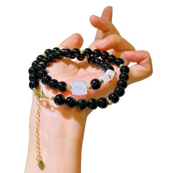


This content is copyrighted by its original authors. In case of any infringement, please contact us for removal.
Comments
Write a comment