Your Emotional First-Aid Palette: Which Colors to Reach for When You Feel Stressed, Tired or Scattered
By RedKnotr Editorial - 01/10/2026 - 0 comments
A headache gets aspirin; a scraped knee gets a bandage. But when the day delivers stress, exhaustion, or a mind scattered across twelve open loops, most of us reach for nothing at all - and simply endure. Color energy traditions propose a small, pleasant addition to the mental medicine cabinet: an emotional first-aid palette, a set of hues you deliberately reach for depending on the symptom.
This is not about repainting your life or believing a sweater will perform miracles. Color psychology and the three-layer mechanism behind color energy both point the same direction: color works through attention, bodily association, and memory - and therefore works best in deliberate, repeatable doses.
The Three Mechanisms Behind Color Energy
Color energy systems describe color acting on a person through three layered channels. First, color guides visual focus - what you see most shapes what your mind orbits. Second, color triggers bodily sensory association: cool blues evoke the temperature of water and shade, warm oranges the heat of sunrise. Third, color awakens personal and cultural memory - the red of celebration and luck, the green of forests and renewal.
Because the channels are layered, the effect of a color is both immediate (a physiological and attentional response) and cumulative (an associative one, built through repeated pairing). That is why practitioners treat color as a practice rather than a trick: the tenth deliberately blue morning does more than the first.
Colors by Symptom
Stressed and wired: reach for blue
Tradition across cultures associates blue with calm, and color psychologists describe it as the "primary color of the mind" - the hue most reliably linked to lowered arousal. Many people find that wearing blue, or simply working near it, steadies a pounding day. Deeper navy shades suit contemplation; lighter sky tones feel like exhaled breath. Blue is also the classic choice for high-stakes meetings, where calm reads as credibility.
Overstimulated and frazzled: reach for green
Green sits at the center of the visible spectrum, and both optics and tradition treat it as the balancing hue - the color of equilibrium. If stress has tipped into sensory overload, green's association with nature and restoration makes it the gentlest choice. A green scarf, a plant on the desk, a walk through actual foliage: all three count as the same remedy at different doses.
Exhausted and heavy: reach for red and orange
Here the palette turns warm. Red is the color of action and vitality - the psychological primary of the body, as color experts describe it, associated with raised alertness and energy. When fatigue is physical and the day still demands output, red is the traditional pick, worn close to the body. Orange offers a gentler version of the same charge: the color of sunrise light, associated with warmth, sociability and balanced energy. A red thread on the wrist - the classic lucky charm across cultures - is a perfectly dosed example: small, constant, and symbolic of life force itself. If you would like one, RedKnotr's red string pieces carry exactly this tradition.
Unmotivated and dim: reach for yellow
Yellow is the color psychologists associate with joy, hope and the nervous system's wake-up response - the hue that excites the eye's receptors most. When the problem is not tiredness but dimness, a small yellow dose - a notebook, a pen, a pocket square - is the traditional nudge toward forward motion.
Tender and raw: reach for pink and soft neutrals
On the days when everything lands painfully, bold contrast can feel like noise. Pink and soft earth neutrals - cream, sand, warm taupe - are the palette's bandages: hues associated with comfort, softness and being held. This is self-soothing through the wardrobe, and it is legitimate.
Build Your Own Three-Color Palette
The practice works best when it is small and specific:
- Identify your two most frequent symptoms. Most people run one or two recurring modes - stressed-and-wired, or dim-and-heavy - rather than all five.
- Choose one remedy color and one balance color. The remedy addresses the symptom; the balance color (usually green or a soft neutral) is your everyday baseline.
- Attach each color to one object you already wear or carry. A bracelet, a scarf, a phone case. The dose must be portable, or it will not be there when the symptom arrives.
Then let the associations deepen. Color energy is built through repetition - the same bracelet touched during the same kind of afternoon becomes, over weeks, a real conditioned signal to your own nervous system.
Accessories Count: Small Doses Work
A common misconception is that color practice requires a new wardrobe. In truth, the accessory layer is where color energy is easiest to dose deliberately - precisely because you choose it each morning with intention, unlike a suit that is just the dress code. A gemstone bead in your remedy color, a woven red string, a boldly colored bag strap: these are the palette's tablets and tinctures, and they pair naturally with the symbolic traditions already woven into jewelry.
FAQ
Do colors really affect mood?
Color psychology research and centuries of color tradition agree on the modest, useful version: color reliably influences attention, association and perceived temperature, and many people find deliberate color choices support mood regulation. It is a support practice, not a treatment.
Which color should I wear when I am exhausted?
Tradition points to red for physical fatigue - the color of vitality and action - with orange as the gentler alternative. Worn close to the body, as in a red string bracelet or bead, it doubles as a symbolic dose of life force.
What colors help with focus at work?
Blue is the classic concentration color, associated with calm alertness, and green supports sustained equilibrium. Many people keep at least one of the two in their workspace - on clothing, a desk object, or a worn accessory.
How do I start a color energy practice?
Start with three colors matched to your most frequent emotional states, attach each to one portable object, and practice for a month. The repetition is what turns color from decoration into a genuine first-aid kit.
Tags: color psychology, emotional first aid, calming colors, mood regulation
Related Pieces
View All →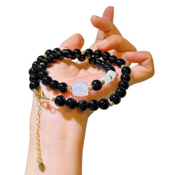


This content is copyrighted by its original authors. In case of any infringement, please contact us for removal.
Comments
Write a comment