The Power Palette: Color Energy for Interviews and High-Stakes Presentations
By RedKnotr Editorial - 14/10/2026 - 0 comments
Before You Speak, Your Colors Speak First
Walk into an interview, a client pitch, or a high-stakes presentation, and something is communicating before you say a word. Posture is part of it. Voice is part of it. But color consultants and image professionals have long argued that your palette does a surprising share of the early work — framing how steady, how trustworthy, and how decisive you appear before the first handshake completes. Color energy, in this sense, is not decoration. It is the first sentence of your introduction. This guide breaks down how to choose that sentence deliberately.
The Three-Layer Logic Behind a "Power Color"
In color psychology, a hue affects experience through layered mechanisms: it directs visual focus, triggers bodily and sensory associations, and awakens personal and cultural memory. Deep navy, for instance, directs the eye calmly, carries associations of the sea and sky — environments where the nervous system relaxes — and draws on cultural memory of uniforms, diplomacy, and dependable institutions. That is why color professionals consistently rank navy as the most universally trusted shade for first encounters: many people find it signals reliability and composure without aggression.
The practical takeaway is not "wear navy everywhere." It is that colors make decisions, and in high-stakes moments you want a palette that has clearly made up its mind.
The Working Palette: Base, Contrast, Accent
Image consultants often describe high-stakes dressing as a three-part palette.
The Base — Navy and Charcoal Carry the Room
For interviews and formal presentations, deep navy remains the professional benchmark: it reads as trustworthy, calm, and team-oriented across most industries. Charcoal gray offers a quieter alternative — analytical and composed, slightly less severe than black, and well suited to roles where thoughtfulness matters more than command. Pure black is powerful but can feel cold or distancing outside senior or creative contexts; many consultants suggest keeping it as a jacket or accessory rather than the whole statement.
The Contrast — Why High Contrast Reads as Confidence
A crisp white or ivory shirt or blouse under a navy or charcoal base creates visual contrast — and contrast itself projects decisiveness. Low-contrast, all-pale combinations are not wrong, but they tend to read as tentative. The sharpness of a defined silhouette also draws focus toward your face, which is exactly where you want attention during a conversation about your ideas.
The Accent — One Point of Personality
The accent is where color energy becomes personal. Used sparingly, an accent communicates energy without stealing focus:
- Deep red or burgundy — determination and drive; a scarf, tie, or stone in this family adds force to a neutral base.
- Emerald or forest green — steadiness and renewal; often chosen for growth-oriented roles.
- Cobalt blue — clear, energetic communication; distinctive without being loud.
- Gold or warm metallics — quiet achievement; classic in jewelry form.
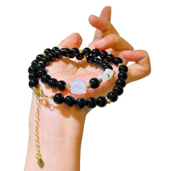
The rule most professionals follow: one statement piece at most. Accessories should frame your expertise, not compete with it — a small pendant or a pair of earrings rather than a stack of clanking bracelets.
Jewelry as the Smallest Possible Accent
Because an accent sits closest to your face when worn at the neckline, a pendant is arguably the most efficient color accent available: it lifts the palette toward your expression, adds one deliberate point of color or texture, and — if you choose a stone for its associations — gives you a private anchor during the meeting itself. A blue-tinted stone like lapis lazuli or sodalite pairs naturally with navy and is traditionally associated with clear communication; a grounding smoky quartz complements charcoal tones. Many people find that touching such a piece mid-presentation works as a small reset — a tactile reminder of steadiness. The gemstone pendants at RedKnotr are designed to be exactly that kind of quiet accent: color with a purpose, sized for the boardroom rather than the stage.
A Five-Minute Color Prep for Any Big Moment
- Two days before: choose the full outfit — base, contrast, one accent — and try it on completely, shoes included.
- The evening before: check the palette against the context. Formal industry? Lean navy and charcoal with a restrained accent. Creative field? The accent can be bolder.
- Morning of: one mirror check in daylight, then stop adjusting. Fidgeting with your outfit during the meeting undoes everything the palette did for you.
Remember the deeper principle: you are not dressing to impress the room. You are dressing so that your own attention stays on your message instead of your appearance. Color energy, used well, removes noise — and what remains is you, speaking clearly.
Frequently Asked Questions
What is the single best color for a job interview?
Deep navy is the most widely recommended choice across industries — it signals trust, competence, and calm while flattering nearly everyone. Pair it with white or light blue for contrast.
Is wearing red to an interview a mistake?
As a full outfit, it can overwhelm — red draws attention forcefully and may read as aggressive in conservative settings. As a small accent, however, many consultants consider it an asset: energy, precisely dosed.
Which colors should I avoid in high-stakes settings?
Neons, washed-out pastels, and muddy mid-tones tend to work against you — the first screams for attention while the latter two read as undecided. Confident colors make a decision.
Does jewelry really affect how professional I look?
Image professionals suggest one or two quality pieces at most. A single well-chosen pendant reads as intentional; oversized or noisy accessories pull focus from your face and message.
Tags: power colors, interview outfit colors, color energy, navy blue confidence
Related Pieces
View All →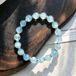

This content is copyrighted by its original authors. In case of any infringement, please contact us for removal.
Comments
Write a comment