Your Season, Not the Shelf: A Five-Minute Guide to Seasonal Colour Analysis and Everyday Colour Energy (October 2026)
By RedKnotr Editorial - 17/10/2026 - 0 comments
Some colours make a face look rested within seconds; others make the same face look tired without changing anything else. Seasonal colour analysis is the system that explains why. It sorts personal colouring into four families named after the seasons, and it has quietly become one of the most practical tools in the colour energy toolbox, because it turns a vague sense of that colour suits me into a palette you can actually shop from. This October, as wardrobes shift toward deeper tones, is a natural moment to find your season.
The Three Clues: Undertone, Depth and Clarity
Analysis begins with three observations. Undertone is the warmth or coolness beneath the skin, read most easily from the veins on the inner wrist in daylight: blue or purple veins suggest a cool undertone, green veins suggest warm, and a mix suggests neutral, which means both families are open to you. Depth is how light or dark your overall colouring is, hair and eyes included. Clarity is contrast: whether your features read crisp and high-contrast or soft and blended. The three clues together point toward one of four palettes, and jewellery is a useful cross-check, since many people find gold flatters warm undertones and silver flatters cool ones.
The Four Palettes at a Glance
Winter: Cool and Clear
Winters carry cool undertones with noticeable contrast, dark hair against lighter skin being the classic signature. Their palette is pure and bold: true red, black, white, royal blue, emerald. Muted camel tones tend to drain them.
Summer: Cool and Soft
Summers share the cool undertone but with low contrast and blended colouring. Dusty rose, powder blue, lavender and dove grey let them look polished without overwhelming; stark black often looks harder than intended.
Spring: Warm and Bright
Springs have warm undertones with a clear, fresh quality. Coral, golden yellow, turquoise and ivory match their natural brightness; heavy dark neutrals can weigh them down.
Autumn: Warm and Rich
Autumns combine warmth with depth: terracotta, olive, mustard, warm brown and cream. Their palette is the spice market, and this season's shop windows are practically curated for them.
The Five-Minute Draping Test at Home
Reading about undertones is one thing; seeing them is another. Near a window in natural light, with no makeup and hair pulled back, hold one garment colour near your face, then a comparison colour, and photograph each. In the right colours, skin looks even, eyes brighten and shadows soften. In the wrong ones, many people find the face gains a grey or sallow cast that the camera makes obvious. Test the pairs that matter most: silver against gold, pure white against cream, and a bright version of a colour against a muted version of the same hue. Two or three rounds are usually enough for a confident read.
Wearing the Palette Without Losing Yourself
Seasonal analysis also pairs naturally with a weekly colour energy rhythm, another way practitioners work with hue. Once your palette is known, you can rotate through it deliberately: a grounding tone on heavy meeting days, a brighter shade when energy needs lifting, a soft neutral when the week asks for quiet. The palette becomes less about rules and more about range, a set of shades you trust to steer the day's tone.
This October, the season itself is doing half the work. Shop windows are full of autumn's spice-market tones right now, which makes it the easiest month of the year to test an Autumn or Winter hypothesis, and the hardest to resist buying outside your range. Take the five-minute test before the shopping trip, write your three best neutrals on a card, and let the palette, not the shelf, decide.
A season is a starting map, not a uniform. The colours nearest the face matter most, so put your best shades in tops, scarves and earrings, and let trousers, shoes and bags carry whatever else you love. If a favourite colour sits outside your season, keep it below the waist or in an accessory, and let your palette frame it. Practitioners of colour energy add a gentler framing: wearing your season is less about optics than about rhythm, a daily cue that the outside of you matches the inside. Many people find that once the palette is right, getting dressed quietly stops being a decision and becomes a ritual.
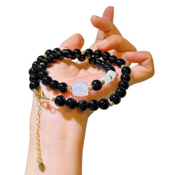
If you would like a tangible anchor for these practices, the crystal and geometric jewellery at RedKnotr is designed to be worn, touched and lived with, not just admired.
Frequently Asked Questions
Can I be between two seasons?
Yes, and neutral undertones make this common. Start with the closer season, wear it for a few weeks, and refine; adjacent palettes share many colours anyway.
Does hair dye change my season?
Significant changes to hair colour can shift your depth or warmth, which may move you toward a neighbouring palette. Re-run the draping test after a major change.
Is seasonal analysis the same as colour psychology?
No. Colour psychology studies how hues affect mood and perception in general; seasonal analysis matches hues to your personal colouring. They work well together.
Do I need a professional consultation?
Not necessarily. The wrist, jewellery and draping tests give most people a reliable starting season, and a professional adds precision only if the result stays ambiguous.
Tags: seasonal colour analysis, personal palette, colour energy, undertone
Related Pieces
View All →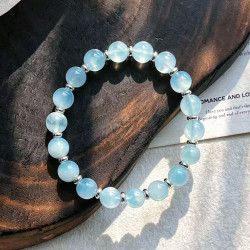

This content is copyrighted by its original authors. In case of any infringement, please contact us for removal.
Comments
Write a comment