The Ten Percent Room: Why One Small Accent Colour Outweighs Four Painted Walls (October 2026)
By RedKnotr Editorial - 02/10/2026 - 0 comments
Walk into a pale, quiet room where one cushion is the colour of ripe persimmon, and watch where your eyes go. Not to the walls, which occupy most of the visual field, but to the cushion. Colour energy does not distribute by area. A small saturated thing can carry more psychological weight than a large muted one - which is why interior designers guard their ten percent so carefully, and why the same arithmetic works on a body wearing a single bold piece.
The 60-30-10 Logic
The workhorse rule of colour proportion is simple: roughly sixty percent of a room in a dominant colour - usually walls, floor, the big furniture; thirty percent in a secondary colour that supports it; and ten percent in an accent that exists to be noticed. The ratio is a guideline, not a law - designers break it deliberately all the time - but as a starting point it encodes something real about attention. A scene with one clear majority, one support and one small point of contrast reads as organised. The eye gets an anchor, a path and a destination.
What happens when the proportions fail is equally instructive. Let the "accent" grow - a giant accent-coloured rug, a wall of saturated drapery - and it stops being an accent and starts hijacking the palette; the room feels loud not because the colour is wrong but because its dose is. Practitioners suggest a fix: move the bold colour into the thirty percent slot and choose a quieter accent, keeping the hierarchy intact.
Count Surfaces, Not Square Metres
One refinement matters more than any percentage: count big visual surfaces, not area. A large dark sofa visually outweighs two pale walls; a glossy black credenza can anchor a room it barely occupies. This is also why the rule transfers so well from interiors to clothing and jewellery. On a body, the "large surfaces" are the coat, the knit, the trousers; the ten percent is the scarf, the earring, the stone at the throat. A saturated gemstone pendant against a neutral knit is the persimmon cushion in miniature - one point of concentrated colour that organises everything around it.
Repeat the Accent Three Times
A single lone accent can read as accidental. Designers suggest repeating the accent colour three times in small doses - cushion, vase, artwork detail - which turns it from an anomaly into a rhythm. The same trick works on a person: earrings, ring and bag sharing one hue. In the three-layer model of colour energy, this repetition works on the first layer directly: guiding visual focus. Where the accent repeats, the eye returns; where the eye returns, the sense of intention follows. The other two layers - bodily association and cultural memory - attach to whichever hue you chose: warmth and appetite in reds and oranges, calm and clarity in blues and greens, and so on through the personal history each colour carries.
Light Changes the Verdict
Colours are judged under the light they are seen in. North-facing cool light cools them; evening bulbs warm them; LED bulbs can skew everything blue or yellow. Before condemning an accent hue, see it under your actual lamps at night - a mustard cushion can turn olive and back again in the space of a day. The same advice applies to choosing gemstones and clothing: judge them in daylight and again in the evening light where they will actually live.
A Three-Day Accent Experiment
Try this at home, then on yourself. Day one: pick one room and identify its ten percent - the small objects that currently carry colour. Remove all but one hue from that ten percent and note how the room reads by evening. Day two: move the same accent hue to three new small objects, scattered rather than grouped, and notice whether the colour feels louder or calmer in rhythm. Day three: wear the experiment - one saturated piece against neutrals, repeated once, an earring plus a ring or a scarf plus a bag. Many people find the wearable version is the one that teaches the principle fastest: the accent is not decoration, it is a statement about where attention should go. If you want a single saturated piece to serve as your ten percent, the gemstone pieces at redknotr.com are built for exactly that role.
Frequently Asked Questions
Must the sixty percent be neutral?
No. A dusty blue or soft green wall can be the dominant colour, especially in bedrooms and studies. If the sixty is bold, keep the thirty restrained and the accent crisp so the hierarchy survives.
Can there be two accent colours?
Yes - designers frequently split the ten percent. The rule of thumb is that together they stay small, and one of the two leads.
What is the best accent for a small space?
A single saturated hue repeated three times in small objects. In tight rooms the accent does the work a feature wall would do elsewhere, so restraint pays double.
How does this connect to colour-energy practice?
The accent is the steering wheel of the first layer: it decides what the eye meets first. Practitioners choose accent hues deliberately - for calm, for focus, for warmth - rather than by trend alone.
Tags: accent colour, 60-30-10 rule, colour energy, visual focus, colour psychology
Related Pieces
View All →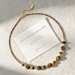


You May Also Like
All Articles →

This content is copyrighted by its original authors. In case of any infringement, please contact us for removal.
Comments
Write a comment