The Loudest Quiet Colour: What Orange Does That Red Cannot (November 2026)
By RedKnotr Editorial - 03/11/2026 - 0 comments
Stand in front of any rack of winter knitwear and find the orange. There is usually one piece, maybe two, and eyes go to it first - not because orange is the biggest, but because the eye cannot decline the invitation. Red pulls harder, but red also warns. Orange does something subtler: it says look here, and it says it with a smile. That difference is the whole subject of this article.
The Colour That Had No Name
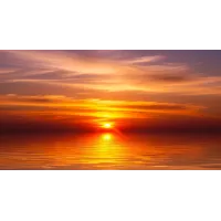
European languages are latecomers to orange. English had no word for it until the sweet orange fruit arrived in the sixteenth century; before that, writers reached for "yellow-red". Once named, the colour was suddenly everywhere it had always been - sunsets, embers, foxes, autumn leaves - the way a new word makes a familiar thing newly visible. November is the orange month in that older, pre-verbal sense: amber light, rusted leaves, spice.
Louder Than Every Hue Except One
In attention studies orange reliably ranks second only to red - and in one respect it outperforms everything: contrast against the sky. Safety orange was chosen for exactly this reason. Traffic cones, life vests, buoys and hunting vests use it because it stays visible against both blue water and grey winter light. Widely reported research on hunter safety notes the same logic from the other side: deer, which cannot distinguish orange the way we do, rarely register the vest a hunter wears for other humans. Visible to people, unremarkable to deer - a very orange kind of trick.
Why Hazard Vests Are Orange and Not Red
Red carries alarm: stop signs, error messages, warning labels. Orange carries attention without the alarm - "notice me, I'm working here". That is why construction crews and road workers wear orange rather than red, and why the colour reads as energetic rather than threatening. In colour-energy terms, tradition holds that orange is the sociable hue: the one that raises a hand rather than raises the stakes. Rooms with warm orange accents are routinely rated as more welcoming in design research, while low-saturation versions - terracotta, clay, burnt orange - rate as calm.
Appetite, Warmth and the Table
Orange's second famous effect is on appetite. Fast-food brands did not choose it by accident. A study from the Universities of Oxford and Valencia, as reported in Chinese health columns, found that hot chocolate drunk from an orange cup was rated better-tasting than the same drink in other cups - one of the cleaner demonstrations that colour shapes flavour expectation. The same columns suggest an orange tablecloth for picky children or low appetites. Practitioners of colour therapy associate orange with the sacral centre and with warmth, sociability and appetite; whatever one makes of the metaphysics, the dinner table is where almost everyone can test it this week.
The same attention-friendly quality has humbler uses around the house. Chinese health columns pass along a practical tip for older family members: orange objects - a phone case, a key pouch, a marker on the light switch - are easier to find and to see, which quietly lowers the risk of a stumble in a dim hallway, and a small orange decal on a glass sliding door keeps it from disappearing at dusk. None of this is mysterious. It is simply the visibility of orange, pointed at the places where noticing matters most.
Wearing Orange Without Shouting
The trick with orange is depth and dose. Bright orange is a burst - powerful, hard to repeat daily, best in small doses: a scarf, socks, a stone at the throat. Muted orange - amber, terracotta, rust - behaves like a neutral with a heartbeat and can carry a whole coat or knitwear piece. Against the skin, warm undertones usually harmonise with softer ambers, while cooler undertones handle rust and burnt shades well. One small object near the face - an earring, a pendant with an amber-toned stone - does more than a large orange garment worn far away. If you want to try the dose-not-shout approach, the amber and carnelian tones at redknotr.com are an easy start. Give it one week and simply watch: what people comment on, and whether your own energy shifts when you catch the colour in a window reflection.
Frequently Asked Questions
Is orange unprofessional at work?
Bright orange is a statement colour; muted orange is not. Terracotta and rust read as considered and warm in almost any office - depth is the whole difference.
What is the real difference between orange and red energy?
Red signals urgency and alarm; orange signals attention and approach. Practitioners summarise it neatly: red says stop, orange says come closer.
Which skin tones suit orange best?
Both, at different depths. Test with a scarf in daylight: bright amber tends to flatter warm undertones, deep rust flatters cooler ones, and most people sit somewhere in between.
Why do I crave orange in November?
Light changes. As daylight shortens, warm hues compensate visually - the same reason interiors turn amber and candles replace ceiling lights. Following the instinct with small doses is the practical answer.
Tags: orange color, color psychology, safety orange, color energy
Related Pieces
View All →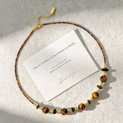


This content is copyrighted by its original authors. In case of any infringement, please contact us for removal.
Comments
Write a comment