The Five O'Clock Flip: Choosing Colours That Survive the Walk Home in the Dark (October 2026)
By RedKnotr Editorial - 17/10/2026 - 0 comments
At nine in the morning, a deep red coat is exactly that: deep red. By half past five, under a sky gone slate and a street lit by shop windows, the same coat can read as almost black — while a navy scarf beside it somehow looks brighter than it did at noon. Nothing changed in the fabric. What changed is the eye doing the seeing. Late October, when dusk arrives before work ends, is the season to plan for it.
The Purkinje Shift: Why Reds Go Dark at Dusk
In 1825 the Czech physiologist Jan Evangelista Purkyně noticed that in the faint light before sunrise, blue objects looked brighter than red ones of equal daytime brightness — and that the relationship reversed as the sun came up. The reason lives in the retina. Daytime vision leans on cone cells, which peak in sensitivity in the green-yellow part of the spectrum; in dim conditions rod cells take over, and their peak sits lower, in the blue-green. As light fades, the eye's whole sensitivity curve slides toward the blue end: blues and greens hold their apparent brightness while reds slide down into darkness. It is the same reason cinema seats are so often red — in a darkened room a deep red fades toward the background and stops competing with the screen.
Why Dusk Colours Look So Saturated
Photographers wait for this hour on purpose. Direct sunlight throws specular highlights across every surface, bleaching out the colour underneath; once the sun drops, those highlights vanish and materials show their truer, deeper colour. In the twenty or so minutes after sunset — the blue hour — a deep cobalt sky balances against the warm gold of lit windows, and the contrast between cool ambient light and warm artificial light reads as richness rather than conflict. That warm-window glow is also, quietly, the best light most of us get on the walk home: narrow, directional and orange-ish — flattering to warm mid-tones, merciless to muddy dark ones.
What This Means for What You Wear
Spend contrast where the eye still has it
In dim light, subtle tonal differences disappear first: a burgundy bag on chocolate-brown wool reads as one dark mass. What survives is strong value contrast — light against dark. If an outfit depends on a quiet, sophisticated contrast, schedule it for daylight; if it must work at night, make sure the contrast comes from lightness and darkness rather than from hue subtleties.
One luminous element beats three dark ones
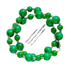
Because blues and greens stay comparatively bright at dusk, a teal scarf, a denim jacket or a pine-green knit keeps doing visual work after the reds have gone quiet. Jewellery earns its place here too: polished metal and light stones catch the streetlamp and window light, giving a small moving point of brightness. Many people find a pendant or bracelet reads as the most visible part of a dark outfit precisely because it answers the light.
Plan for two lights, not one
The walk home passes through office light, then sky light, then shop-window light. A colour that only works under one of them is fragile. The practical test is the hallway at evening — most home hallways are a reasonable proxy for the dim middle of that journey, and an outfit that survives the hallway mirror will survive the street.
The Three-Colour Dusk Rule
For the darker months, build outfits on three slots: a mid-tone base that does not depend on bright light; one deep anchor — near-black, deep brown, oxblood; and one light-catcher — a pale blue-grey, a soft gold, or a light stone at the throat or wrist. The base carries the day, the anchor gives shape, and the light-catcher is what stays legible at 5:40 p.m. It is a quiet, structural kind of colour energy: less about what a hue means and more about what it can still do when the light is leaving.
If the light-catcher slot is where you want a small wearable piece — something that catches streetlight without shouting — the everyday pieces at redknotr.com are made to be worn through exactly this kind of evening.
Frequently Asked Questions
Why does my red coat look black at night?
In dim light vision shifts toward the rod cells, which barely register deep red. The fabric is unchanged; the eye's sensitivity curve simply slides toward blue, leaving reds darkest of all.
Which colours stay visible at dusk?
Blues and blue-greens hold apparent brightness best, and anything reflective or polished — metal, light stones, pale scarves — catches the remaining artificial light.
Is the Purkinje effect why cinema seats are red?
It is part of the answer: deep red fades toward darkness in a dim room, so seats stop distracting from the screen. Practicality and tradition both kept the choice.
Does indoor lighting change the effect?
Warm household bulbs soften it but do not remove it — most evening errands happen under a mix of dim ambient light and warm pools, which is exactly the condition the dusk rule is built for.
Tags: color psychology, dusk light, winter palette, color energy
Related Pieces
View All →





This content is copyrighted by its original authors. In case of any infringement, please contact us for removal.
Comments
Write a comment