The Colour Your Plate Wears: What Food Colour Psychology Honestly Tells Us (October 2026)
By RedKnotr Editorial - 12/10/2026 - 0 comments
Walk down any high street and you will pass the same palette three times: the red of the burger sign, the yellow of the fried chicken bucket, the red-and-yellow duopoly of fast food. The design folklore says warm colours make you hungry. The research says something more interesting — and more useful for anyone who wants to use colour deliberately at their own table.
The Red Surprise
Start with the experiment that breaks the folklore. In controlled studies on food consumption, red did not increase how much people ate. It reduced it — at least for snacks and sugary drinks. The likely explanation is that red carries a second meaning that competes with appetite: stop. Red traffic lights, red warning labels, red correction ink. When the hue arrives on packaging or plateware, some of that caution signal rides along, and people take less.
So why is fast food drenched in it? Because context changes everything. Red paired with yellow in a branding context reads as speed, energy and value, nudging quicker ordering decisions. Red on a plate of snacks reads as a brake. Same wavelength, opposite effect — which is the first honest lesson of food colour psychology: hue alone does nothing. Hue plus context does everything.
Blue's Bad Reputation at the Table
Blue and green's absence from food marketing is not an accident. In nature, blue-green tones often signal mould, spoilage or toxicity, and the research reflects that inheritance. Studies of colour preference in food contexts have repeatedly found blue-green among the least appealing hues, and a 2017 study of hot soup — admittedly with a small sample of twelve young women — found the blue-coloured soup rated substantially lower on willingness to eat, palatability and warmth than identical white and yellow versions.
But before anyone orders a set of blue plates as a diet tool, the honest caveats. The soup study was tiny. Plate-colour research overall is messy: a 2018 crossover trial found people ate more from red plates than white ones, while other experiments found the opposite. The lesson the researchers themselves draw is not "blue plates suppress appetite" but something subtler — colour interacts with the food, the contrast, the expectation. A blue plate under a golden omelette is a frame fighting its painting.
The Blue Exceptions Worth Remembering
Culture can override the inheritance. Blue cheese, blue corn tortillas, blueberries, butterfly-pea lattes and blue smoothie bowls are all beloved precisely because a strong culinary context reframes the hue. The colour did not change; the story around it did. That is the second honest lesson: colour energy at the table is negotiated, not decreed.
Visual Congruence: The Principle That Actually Holds
The most robust finding across recent studies — including a 2020 experiment with 448 participants — is that food should look like itself. When familiar sweet foods were digitally recoloured red or blue, willingness to eat dropped compared with the originals. Warm colour helped only when it made the food look like a believable tomato, peach or crust; it hurt when it made a biscuit look dyed. Researchers summarise this as visual congruence: the visual promise and the eating experience must tell the same story.
This is why "warm colours increase appetite" fails as a rule but works as a tendency. Warm hues flatter warm foods — roasted, baked, spiced, caramelised. Cool hues flatter cool foods — herbal, fresh, briny. The menu designer's real skill is not choosing a colour but choosing which colour agrees with which dish.
Using This at Your Own Table
Translated into everyday practice, the research supports a handful of moves that cost nothing:
- For more mindful portions: many people find that cooler, muted tableware — slate blue, sage, deep green — naturally slows snacking, partly through the spoilage association and partly because muted settings invite slower eating. Chinese health writing makes the same observation: cool tones at the table reduce eating quantity.
- For appetite that has gone missing: the reverse. Warm, saturated accents — terracotta bowls, amber glass, a rust napkin — frame food with warmth, and the contrast between vivid food and a calm plate makes the dish itself the brightest thing in view.
- Contrast over matching: pale food on pale plates reads as bland regardless of taste. Colour contrast between plate and dish is one of the few near-universal findings — white plates flatter almost everything, and dark plates make bright ingredients glow.
- One saturated note, not ten: a plate with one vivid element — roast tomatoes, a mango salsa, red cabbage slaw — focuses the eye the way a single accent colour focuses a room. Everything vivid at once and nothing leads.
The Symbolic Layer at the Table
Colour-energy practitioners read the table the way they read a room: every hue carries a bodily and cultural memory. Red carries heat, urgency and celebration — think of festival foods across cultures, from wedding banquet red to tomato-rich Sunday sauces. Green carries freshness and safety, which is why herbs are the universal garnish. White carries cleanliness and restfulness, the reason plain plates became the restaurant default. None of these are laws of nature; they are accumulated associations, and your own history edits them. If your grandmother's kitchen was turquoise, turquoise at your table may comfort you where it unsettles others.
That is the final honest lesson, and it applies well beyond food: colour energy works through the perceiver, not on them. The plate is an experiment with a sample size of one — you. Try a week of warm settings, a week of cool, and read your own ledger of how each meal felt. If the exercise turns into something you enjoy, you may find the same attention spilling into how you dress the rest of your life. A stone in a colour you chose deliberately — for the table's warmth or your wrist's calm — does the same quiet work of making intention visible. You will find such pieces at redknotr.com.
Frequently Asked Questions
Do blue plates really help you eat less?
Some small studies suggest cool colours can slightly suppress appetite, likely through associations with spoilage, but the evidence is thin and inconsistent. A more reliable lever is contrast and congruence — plates that frame the food honestly and invite slower eating — rather than expecting one hue to do the work.
Why does red both stimulate and suppress appetite?
Red carries two competing associations: warmth and energy, which branding uses, and warning or "stop", which appears in consumption studies. Which meaning dominates depends on context — signage and branding tend to activate the energetic side, while red on or around food itself can activate the caution side.
What is the least appetizing colour for food?
Research and surveys repeatedly point to blue-green tones, which many people associate with mould or decay. The effect is cultural rather than absolute — blue cheese and blue corn show that a strong food story can override it entirely.
Can colour psychology at the dinner table help picky eaters?
It can help indirectly. Increasing colour contrast, presenting familiar foods in their expected colours and using warm, calm lighting all reduce the visual "weirdness" that puts cautious eaters off. It is a comfort measure, not a treatment; persistent eating concerns belong with a health professional.
Tags: food colour psychology, plate colour, appetite, visual congruence, colour energy
Related Pieces
View All →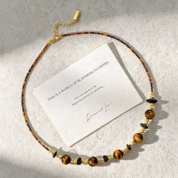


You May Also Like
All Articles →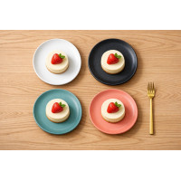

This content is copyrighted by its original authors. In case of any infringement, please contact us for removal.
Comments
Write a comment