The Two-Minute Room Test: Using Colour Energy to Set the Tone of a Space and a Day
By RedKnotr Editorial - 11/10/2026 - 0 comments
Colour is the fastest sensory signal you process. Before you have read a room, you have already responded to it, and before you have decided how you feel about a day, its colours have had a first word. Colour energy treats that response as a usable system rather than a matter of taste.
Why Colour Carries Energy at All
Practitioners describe three layered mechanisms. The first is visual: certain hues direct attention and rest the eye, while others demand it. The second is bodily: colours carry learned sensory associations that show up as physical responses — warmth, appetite, alertness, ease. The third is memory, both personal and cultural, where a specific shade triggers a specific history.
None of these layers requires a metaphysical claim. The system works because attention, physiology, and association are real, and because you can choose deliberately which of them to put in front of yourself.
The Practical Palette
Rather than a full colour wheel, most everyday work needs only a small set of reliable hues and one honest question: what do I want to happen in this space or this hour?
- Green — the most generally restorative hue. It rests the eye, softens a room, and suits spaces where you want to stay for a long time without strain. Dining and living areas tend to benefit most.
- Blue — cooling and slowing. Excellent for bedrooms and any space where the goal is unwinding. In quantity it can tilt cold or muted, so most practitioners balance it with something warm nearby.
- Warm neutrals and sand tones — the quiet backbone. They hold a room together without pulling attention, which is exactly what you want under anything you need to concentrate on.
- Yellow — energising and quickening, which is why it reads as cheerful and why too much of it becomes restless. Best used in small doses rather than as a wall.
- Red and deep orange — stimulating and mobilising. Good for spaces where movement and warmth are wanted, difficult to rest inside.
- Pink — softening. Notably useful as a small accent rather than a large one; it dampens a sense of urgency without disappearing.
The Two-Minute Room Test
Stand in the doorway and name the first three things your eye lands on. Those three objects are doing most of the work of the room, regardless of what colour you painted the walls. If the first thing you see is an anxious colour in an anxious place, moving it costs nothing and changes the room immediately. Most colour energy work is really this: editing what is in the line of sight.
Dressing With Intention
For personal use, the easiest method is to pick a single colour as the day's key — one scarf, one shirt, one bracelet — and let the rest of the outfit stay neutral. A single hue carried through the day acts as a reminder of whatever state you decided to practise. Doing this with a whole wardrobe of strong colours tends to cancel out; doing it with one does not.
Warning Signs of Overuse
Colour that is too loud, too large, or too uniform stops doing useful work. A room in one saturated hue becomes tiring rather than atmospheric; an outfit in one intense colour starts to carry you rather than the other way round. The signal is simple: if the colour is what you notice, and not the people or task inside it, it is probably too strong.
Building a Colour Rhythm
A pattern that many practitioners find practical is to assign colours to time slots rather than to personality. Mornings get something bright and lifting; deep work periods get something neutral so it does not compete; evening gets something warm and low-contrast. Over a week, that gives you a rhythm of colour rather than a mood board, and rhythm is what makes it stick.
It also protects you from the trap of chasing a colour because it is trending. A hue that floods your life for one season and disappears has no rhythm in it at all.
A Deliberately Small Start
Change one thing. Move the loudest object out of your sightline. Pick up a single coloured piece before a meeting you are nervous about and treat it as a cue. Wear the same colour on the days when you need the same state.
If you would like that cue to be something you put on, our colour-linked zodiac pieces are designed for exactly this single-hue role.
FAQ
Do the psychological effects of colour work the same way for everyone?
No. The general direction tends to hold, but personal memory changes the details considerably. Treat any published colour chart as a starting point and let your own responses refine it.
Can colour replace other approaches to mood or energy work?
It is one input among several. Practitioners treat it as a support to sleep, routine, and attention habits rather than a substitute for them.
What if my space can't be repainted?
Most colour work happens in what is visible, not what is structural. Textiles, an accent piece, a single object in your line of sight, or the colour you wear each carry the same cue with no renovation required.
Should I use the same colour every day?
Repetition is what builds the association, so yes for a chosen period — a week or a month. Rotating constantly keeps the colour novel, which is the opposite of what a cue is for.
Tags: Color Energy, Color Psychology, Room Color, Daily Hue
Related Pieces
View All →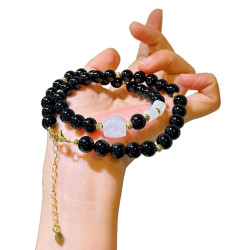


This content is copyrighted by its original authors. In case of any infringement, please contact us for removal.
Comments
Write a comment