October's Color Rhythm: Dressing for the Seasonal Pause with Rust, Burgundy and Olive
By RedKnotr Editorial - 08/10/2026 - 0 comments
The Liminal Month: Why October Invites a Palette Pause
October is an in-between month. Summer has faded into memory but winter has not arrived, and the energy of the season carries a softer hum — a natural pause in the year. Color practitioners describe this liminal quality as an invitation rather than a lull: a chance to slow down, take stock, and let the nervous system settle before the year's final push. In the three-layer logic of color energy, a seasonal palette works by guiding your visual focus, triggering bodily sensations of warmth or coolness, and awakening cultural memories of harvest and hearth. Worn deliberately, October's colors become a way to tune your inner rhythm to the season's.
The idea is simple: you cannot regulate mood with willpower alone, but you can regulate what your eyes meet all day. Many people find that a considered palette does quiet, cumulative work on attention and mood.
The October Palette and What Each Hue Holds
This month belongs to warm, earthy depth — with room for one or two clarifying accents.
Rust and Burnt Orange
The signature shade of the season. Rust carries the bodily memory of fallen leaves, woodsmoke, and low golden light. Practitioners associate it with grounded vitality — warmth without urgency — which makes it a strong choice for days when you want energy that stays steady rather than spiking.
Burgundy
Deep red brings gravity and depth. Tradition holds that dark reds evoke ripeness rather than alarm: the color of late fruit, wine, and velvet. Worn near the face — a scarf, a knit, a stone at the throat — many people find it reads as quiet confidence, a step softer than bright crimson's call to action.
Olive
Olive connects the wardrobe to the changing landscape and is often described as the color of practical resilience. It sits between the aliveness of green and the stability of brown, a good anchor for weeks that demand both adaptability and follow-through.
Chocolate, Camel and Cream
Chocolate replaces summer black as the softer neutral; camel and tobacco bring daylight warmth; cream and oatmeal keep the darker shades from becoming heavy. The easiest October formula is restraint: build each look around two or three tones — a chocolate coat over cream knitwear, olive softened with oatmeal — and let texture, not color count, create the richness.
Two Clarifying Accents
Color therapists sometimes add a pale, crystalline blue for mental fog and a slate grey for steadiness in the in-between. Neither is seasonal in the harvest sense, but as accents — a stone, a lining, a pair of earrings — they lend October's warmth a note of clear, unhurried thought.
Building a Two-Color Daily Practice
Translating the palette into a mood practice takes about a minute each morning:
- Ask one question: what does today need — steadiness (earth tones), warmth (rust, burgundy), clarity (pale blue, cream), or quiet strength (olive, slate)?
- Choose the anchor: one garment or accessory in the answering hue. On busy days, jewelry is the most reliable anchor — a carnelian-toned or earthy pendant keeps the color at eye level all day.
- Set the intention: while putting the piece on, name the quality you are borrowing from the color. Ten seconds is enough. A crystal or color-anchored piece from RedKnotr works well here, because the stone carries both the hue and the tactile reminder.
- Close the loop: in the evening, notice whether the day's color matched its reality. The comparison itself sharpens your sense of which hues genuinely shift your state.
Over a few weeks, the practice tends to reveal a personal signature: the two or three colors that reliably return you to balance. That is the real goal — not a wardrobe rule, but a working correspondence between hue and inner rhythm, built from your own observations. Because in this season, as color writers like to say, there is power in the pause.
Frequently Asked Questions
Do seasonal colors only affect mood through fashion trends?
No. The trend layer is surface; the working mechanisms are visual focus, bodily sensation, and cultural memory. A rust scarf works whether or not it is fashionable this year.
Which October color is best for anxiety?
Practitioners often point to cream and oatmeal for softening, slate grey for steadying, and deep green-olive for grounded calm. Personal testing matters more than any universal rule.
Can I mix October's warm palette with cool accents?
Yes, and many people find the contrast clarifying. Keep warm earth tones dominant and use one cool accent — pale blue, slate — at a small scale, such as a stone or a thin layer.
Is there a difference between color energy and color psychology?
Color psychology studies measurable responses to hue; color energy traditions extend the same observations into symbolic and spiritual practice. This article uses the practical overlap of both: observation first, meaning layered on gently.
Tags: Color Energy, October Palette, Seasonal Colors, Mood Regulation, October 2026
Related Pieces
View All →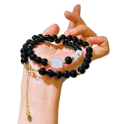


This content is copyrighted by its original authors. In case of any infringement, please contact us for removal.
Comments
Write a comment